CSS特效集锦:视觉魔法的碰撞与融合(二)
引言
-
CSS有他难以做到的事情,我们帮他用lottie解决
-
CSS有他可以做到的事情,我们用我们的头脑帮他解决
本文实现的CSS效果一览
-
标题吸顶
-
手写箭头
-
文字背景
-
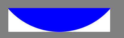
圆形天坑
-
按钮波澜
-
动态方形
-
加载骨架
-
多行省略
标题吸顶
.sticky {
    z-index: 100;
    width: 500px;
    height: 20px;
    background: red;
    position:sticky;
    position: -webkit-sticky;
    top:0px;
}

<div class="sticky" style="margin:30px;">
</div>
手写箭头
-
先画一个div,border设置成箭头的颜色,同时呢,把div左边和下边的border变透明
-
再然后呢,把这个div右转45度:transform:rotate(45deg),这样就可以得到右边的箭头了
.arrow {
    width: 50px;
    height: 50px;
    border:10px solid blue;
    border-left-color: transparent;
    border-bottom-color: transparent;
    transform: rotate(45deg);
}

<div class="arrow" style="margin:30px"></div>
文字背景
-
A:CSS文字背景怎么实现?
-
B:我知道我知道!text-background
-
A: 你的猜测非常合理!但如果我们真有这个CSS属性就好了
body {
    background: #fff;
}
.text-bg {
    width: 800px;
    font-size: 70px;
    font-weight: bold;
    background: url(../demoImage/sea.jpg);
    background-clip: text;
    -webkit-background-clip: text;
    color: transparent;
    -webkit-text-fill-color: transparent;
}

<div class="text-bg" style="margin:30px">
  <p class="text">我叫彭湖湾,请叫我胖湾</p>
</div>
圆形天坑
.hole-wrapper {
    overflow: hidden;
    position: relative;
    width: 300px;
    height: 70px;
    background: white;
}
.hole {
    border-radius: 50%;
    background: blue;
    position: absolute;
    bottom:0;
    left:50%;
    margin-left: -200px;
    width: 400px;
    height:400px;
}


<div class="hole-wrapper" style="margin:30px">
  <div class="hole">
  </div>
</div>
按钮波澜
-
波澜的轮廓是一个不断扩大的圆,我们联想到可以通过变化的transform:scale()控制大小的变化
-
圆随着扩大越来颜色越淡直到消失,我们可以给他设置白色background,并且通过变化的opacity控制透明度的变化
-
通过animation来控制每个阶段,圆的具体的大小和颜色浓淡变化
@keyframes wave{
    20% {
        transform: scale(0.2);
        opacity: 0.8;
    }
    40% {
        transform: scale(0.4);
        opacity: 0.6;
    }
    60% {
        transform: scale(0.6);
        opacity: 0.4;
    }
    80% {
        transform: scale(0.8);
        opacity: 0.2;
    }
    100% {
        transform: scale(1);
        opacity: 0;
    }
}
.button {
  overflow: hidden;
  position: relative;
  border:2px solid #fff;
  background:#2894FF;
  border-radius: 10px;
  width: 200px;
  height: 50px;
}

.wave {
    border-radius: 50%;
    position: absolute;
    top:50%;
    margin-top: -200px;
    left: 50%;
    margin-left: -200px;
    background: #fff;
    width: 400px;
    height: 400px;
    transform: scale(0.01);
    opacity: 0;
}
/* 悬浮替代点击 */
.button:hover .wave{
  animation: wave linear 1s;
}
<div class="button" style="margin:30px">
  <div class="wave"></div>
</div>
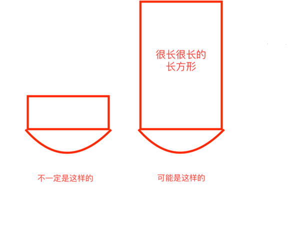
动态方形
-
A:你实现一个高度和宽度一样的正方形!
-
B:太简单了!不要耍我!我会width:20px;height:20px;
-
A:但是,我的要求是要随外部div的长度变化,而变化的正方形
-
B:还是太简单了,我会width:20%;height:20% 。。。。。(被打断)
-
A:但是!这个外部包裹的div可能是一个变化的长方形!而你还是要在里面实现一个宽高成比例变化的正方形!
-
B:喵喵喵???
/* 不知道是哪个大猪蹄子想出来的运行不了的方法 */
div {
  width: 20%;
  height:calc(width)
}
我们的思路
.square-wrapper {
    display: flex;
    justify-content: center;
    align-items: center;
    border: 2px solid blue;
    width: 300px;
    height: 200px;
}

.square-wrapper:hover {
    transition:width 2s,height 2s;
    width: 400px;
    height: 300px;
}

.square {
    background: red;
    width: 25%;
    padding-top:25%;
}

<div class="square-wrapper" style="margin:30px">
        <div class="square"></div>
</div>
加载条
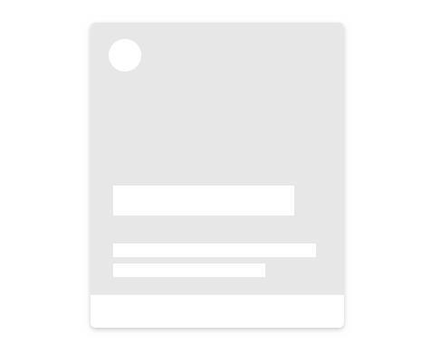

.content {
    width: 200px;
    height: 20px;
    background:red ;
}
.content:empty{
    background: grey
}


<div class="skeleton" style="margin:30px">
  <div class="content">我有文本内容呢</div>
  <div class="content"></div>
</div>
怎么让加载条动起来
单/多行省略
<div style='width:400px;
height:70px;
border:1px solid red;'>
<p style='display: -webkit-box;
-webkit-box-orient: vertical;
-webkit-line-clamp: 2;
overflow:hidden;'>
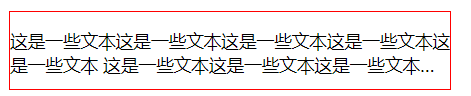
这是一些文本这是一些文本这是一些文本这是一些文本这是一些文本
这是一些文本这是一些文本这是一些文本这是一些文本这是一些文本
</p>
</div>
【CSS/JS】如何实现单行/多行文本溢出的省略(…)–老司机绕过坑道的正确姿势
总结和感悟
个人介绍
大家好! 我叫彭湖湾,CSS职业选手,18年中韩前端大师邀请赛垫底最后一名,JavaScript排位赛中国区广东分区前1600强,我擅长使用的英雄是React和Vue,快速响应从而给短时间内敌人造成大量伤害! 我喜欢使用的武器是Node.js,但是武艺不精经常误伤自己,我的口号是:“我是IE守护者,痛击我的队友,保护我的敌人! ” 9102年9月1日,我将在知乎前端职业联赛ZPL (Zhihu Pro League)上送上我的精彩表现,敬请期待!